Friday 29 October 2010

First Influence Map

I picked folder 9 which contained 'The NeverendingStory'
after reading through the extracts, I started doing a few influence maps.


This influence map is for one of my favourite descriptions in the first extract I have.

Thursday 28 October 2010

The Cabinet of Dr.Caligari (1920)


This film was quite hard for me as I found the music to often be irrelevant to the scene and as there was no speech and the music was so distracting, it was quite an intense watch. Aside from the terrible music, it is obvious that this film was most definitely an inspiration for many films that were to be made after it. You can clearly see a few distinctive things that have been repeated through to modern cinema such as the use of shadows to suggest things and unexpected twists near the end.

 ''With a zombie-like killer and twist-in-the-tale this anticipates everything from psychological thrillers to stalk 'n' slash.'' Film 4 review


The film also had a few influential comedic elements such as when Dr.Caligari (Werner Krauss) was asking to be part of the fair and the guy yells at him to "wait!" then shows close ups of Krauss looking around fidgeting before asking again and being shouted at to ''WAIT!!!''. This is the sort of scene that would typically be in a Ben Stiller /Adam Sandler /Jim Carey movie for example.
But rather obviously, the main attraction is the strange visuals. Often the viewer has no choice as to where they should be looking, due to forced perspectives and close ups. All of the buildings and sets are at odd angles and often seem impossible, especially the paths going off into the distance and the unbalanced buildings and rooms.

"...slathering the screen with forced perspectives and all kinds of bizarre diagonals and slants; there is hardly a right angle to be found in this film." Jeffrey M. Anderson, Combustible Celluloid


One of the most interesting sets is the town square. With its lopsided buildings and narrow paths which look awkward and make it hard for people to go about their business without pushing past each other, it creates a very abstract version of a small town. Also, the make up, hair and costumes create an even stronger contrast of black and white that continues through the film. It's almost as if, even in colour, the characters would be wearing blacks and whites.


"Heavy stage mannerisms and makeup underscore the disorienting non-naturalistic backdrops, giving everything a skewed fun-fair-room effect.  Eye-shadowed and powdered pale, faces are lit from below in isolated iris-circles" Donald Levit, RealTalkReviews


This abnormal style is common in the fine art world, but seems to have lost its way throughout the years of film. It was a nice change to the ultra-realistic scenes we are used to seeing nowadays.

Tuesday 26 October 2010

Negative Space - Life Drawing

This time Chris asked us to draw the negative space as opposed to the actual model. I was familiar with this exercise and found it relatively simple but also enjoyable as it gives a new way of looking at things rather than just assessing the different tones of skin.


Friday 22 October 2010

My Final Final Final Piece :)


So this is my final piece! I am extremely happy with it, especially the face. There were a few things I'd do differently next time if I'd managed my time more effectively, but overall I am very proud of what I have achieved considering I had minimal Photoshop knowledge prior to this unit.


This is the development of my final piece, from outlines to the finished product.

Elephant Man (1980)


Film - The Elephant Man (1980)
Director - David Lynch
Writer(s) - Eric Bergren, Christopher DeVore, David Lynch

Cast:
Anthony Hopkins - Dr. Frederick Treves
John Hurt - John Merrick
Anne Bancroft - Mrs. Madge Kendal
John Gielgud - Carr Gomm
Wendy Hiller - Mothershead
Freddie Jones - Bytes

It would take a heart of stone not be moved by "The Elephant Man". Based upon the true story of the horrendously deformed John Merrick (Hurt), this tale of a pure soul struggling to be heard over the prejudice of the many is quite heart-rending. -  Almar Haflidason

David Lynch's The Elephant Man is story about a doctor, Frederick Treves (Anthony Hopkins), and a disfigured man John Merrick (John Hurt). Treves buys Merrick from the circus freak show he is a part of and studies his condition. After studying him both Treves and Merrick become well known through the newspapers and people become more and more interested in the elephant man. It is here that Treves realises that he has become no better than Merrick's previous owner and has turned him into a showpiece. The night guard at the hospital takes advantage of Merrick's popularity and starts charging people to see him at night. One night his previous owner shows up and takes Merrick back to the freak show. With the help of the other acts he is able to escape and make his way back to the doctor. In the end Merrick decides to try sleeping lying down which he knows will kill him from not being able to breathe.

"Posh London society replaces the sideshow punters, and Merrick is essentially still on display. This worsens when the hospital night porter (Elphick) starts showing Merrick off to his drunken pub mates by night." - Film 4 review


Although there is no actual metamorphosis in the film, it attempts to capture a more realistic example of what such a change in physical appearance is like. It shows the emotional effects it might have and the film is mostly about how people can be discriminated against based on appearance. Merrick wants to fit in and enjoys being talked to like a normal human being when posh people come to visit him as he gets to talk about literature and theatre. At one point during the film he is chased and cornered and says "I am not an animal! I am a human being! I am a man!". As well as showing the effect of such a deformity on the individual it also shows how society is fascinated by these things at the same time as casting these people out.

"Appearances are all, and like the proverbial Victorian piano, he can make the social grade only if his ruder appendages are hidden from sensitive eyes; hence what is effectively, at his time of greatest happiness, his suicide." - Time out film guide


Life Drawing

Week 2

Week 2

Week 2 - [L-R, quick study, only using lines and squares, geometric version of anatomy]

Week 3 - Everyone went round drawing on each others' easels and this is how mine ended up!

Week 3 - This was a blind sketch. To mix it up a bit, Dayle and I swapped after the 5 minutes and added to each others

Week 3

Week 3

Week 3

Week 4

Week 4

Week 4 - 5 minute sketch with mega hard foreshortening, but I think I was quite successful

Week 4 - 1 minute pose

Week 4 - 1 minute pose

Week 4 - 1 minute pose


Week 5 - Study 1 - Really liked the head, but the arm started looking a bit rubbish, so I started another study


Week 5 - Study 2 - Thought I'd make the model look like a walrus so it could link into my unit

Then finally, Week 5 - Final sketch, took around 45 minutes. I couldn't see the right side of the model as there was a skeleton there... and it got a bit smudged in my bag unfortunately

Tuesday 19 October 2010

Development that I hadn't put up yet


And like everyone else, I analysed the bone structure in order to get a better understanding of how I might have to change in order to turn into a walrus. 


Monday 18 October 2010

Final Image - In Progress

 I had the pose idea from the beginning really as I was sure that I wanted to look horrified in a 'don't look at me!' kind of way. I had looked at a few 'how to' blogs and I realised I struggled with drawing in the Z axis; I always draw either side or front on. So I decided I wanted to make it more dynamic and add some drama to it. As previously mentioned, I had thought about using extreme angles like Jenny Saville, so I chose to angle it from underneath. In order to get a good idea of how this would look, as well as being an effective way to figure out the lighting, I got a bit of help posing a pre-rigged character in Maya. Being able to position a character and reposition light to get the effect I wanted was unbelievably helpful as I'd imagined this pose for a long time but been unable to replicate it on paper or photoshop.
This is the model in the position that I liked. Made to look fatter and the fingers have been lengthened.
I then drew over it roughly on photoshop but making it more walrus-y. Here I joined the feet together to make a tail, but the whole thing looked a bit like a sleeping bag :/ also, hair = bad. Was supposed to look wet/ falling out/ half balding...
Then I decided to make a mash up of all the pictures I'd taken/drawn/found to give me a better picture of how to make it work. It slightly helped, but I did end up making A LOT of adjustments, such as curves in the back/bottom area, as well as the flipper and tail/feet. Also, I didn't want it to look like I was 'ripping off' the picture used for the tummy, as I'd always wanted it to be just like an obese disgusting woman walrus thing.

This was my first final outline. I didn't like the little tuft of hair, and the bum was TOO big and the perspective I was trying to achieve didn't really work on the arm reaching to cover the face. It looked too bulky down that side and the flipper wasn't easily identified as a flipper... Also, the feet were making me frustrated as no matter how much I warped them or moved them, they never quite looked right. I tried a few different combos but ended up resorting to a tail, which was okay really as it was kind of lacking in the walrus-ness.
This is the finished outline. I'm very pleased with it. By changing the flipper, it has much more depth and it is more recognizable as a flipper now. The tail looks like a good inbetween of a tail and a foot. The curve of the general image works much better thanks to moving the boob and decreasing the back/bottom curve. I really think drawing over a photo of my face has helped to make it look more like me, as well as capturing an accurate emotion. I want to show how horrific the transformation is and how gross and painful it can be. Hence the expression, bones bursting through the fingertips and blood dribbling from where my teeth have extended into tusks. Through the shading and colouring, I intend to add more skin ripping apart and other painful transitions.
One thing I was unsure about was having the 'private parts' exposed...? I think it works and it's not like people haven't seen them before, but it just might be a bit awkward when I have to present it! any suggestions? or shall i just keep it there? [i do have a layer in the photoshop file with some pants! haha]

And finally this is the initial blockout.


The Fly (1986)

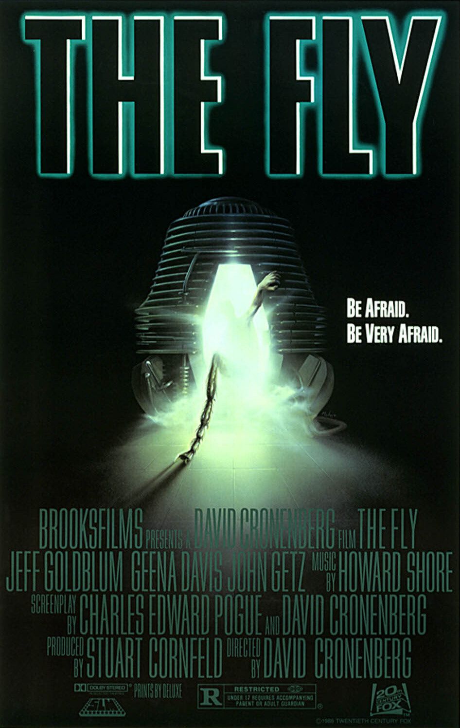
Film: - The Fly (1986)
Director: - David Cronenberg 
Writer(s): - Charles Edward Pogue, David Cronenberg

Cast:
Jeff Goldblum - Seth Brundle
Geena Davis - Veronica Quaife


This remake of the 1958 classic has relatively little in common with the original. The only thing in terms of plot that the two films have in common is the splicing of a scientist and a fly after experimenting with teleportation. Other than this they go in very different directions.

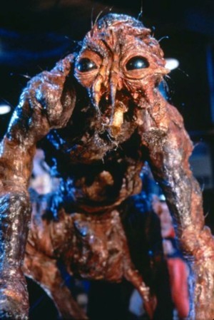
In the 1986 version of The Fly the protagonist, Seth Brundle, is secretly working on a teleportation device because he doesn't like vehicles. After several failed attempts at telepoting organic materials and getting involved with a journalist, he finally works out all the kinks in the device. He then decides to test it on himself which appears to be success with the added bonus of super strength and agility. There was however a fly in the teleportation pod with Seth and he soon starts to show the effects of the fly DNA physically and mentally.
The metamorphosis of Seth into the Fly shows similarities to a body wasting disease, specifically aids, as apposed to the original's simple body part swapping:

"Cronenburg's The Fly (1986) is most persuasively to be claimed as "an aids movie" when it centers on bodily declension (at least when considered from the human point of view) and the negotiation of disgust between the erstwhile lovers" - The politics of popular representation: Reagan, Thatcher, AIDS, and the movies, by Kenneth MacKinnon 


The fear of aids was very high at the time as people didn't know much about it. The film reflects a number of fears related to aids such as transmission to another generation as shown by Veronica wanting to abort Seth's baby as she is afraid it will be "deformed". Even though Seth becomes a monster he is still portrayed as a victim of the disease and never quite loses his humanity. At one point he tells Veronica to leave as he is worried that he might hurt her, he is also worried that he might be contagious.

"The monsters were becoming victims and protagonists who's difference provoked empathy and facination as much as horror..." - Film, horror, and the body fantastic, by Linda Badley
This film really goes down the gore route which I found quite hard to watch as I'm not very good with that sort of thing! It does however manage to use this to show how horrific disease can be reinforcing the fears people have of it.

"Cronenberg's direction in The Fly features many of his stylistic stereotypes-dark, grayish tones, somber moods, ambiguous, gruesome biological masses and sex scenes that make us queasy as much as they titillate." - Classic-horror.com review, by Brandt Sponseller